Sunday, December 9, 2007

Skate deck

I may have spent way too long on this, but I'm happy with how it turned out. Part of the time factor is due to my having worked on areas that will not actually show anyway...I know that sounds like an incredibly stupid thing to do, but let me explain. I could easily have gotten away with cutting out the fret board, since it will be covered by the board's trucks anyway; however, it just seemed like a cop-out to me to do so. Also, I figured that if I wanted to display the design, it would look silly without that area. So I added a fair bit of work time by incorporating that area into the finished piece, but it looks good now and I can use it for other purposes without having to go back in and make too many adjustments to it.
BUT--there are a few things I wish I could improve about the finished, printed piece: 1) I don't think it's weatherproof--although it was printed on vinyl, it is not laminated and is therefore susceptible to the elements.
2) for the same reason (i.e. lack of lamination), the colours are not as vivid as in my test print--apparently the material soaks up some of the pigment, but laminating a piece would bring the levels back up again (so my printer told me).
3) I didn't do as good a job of sticking it to my deck as I would have liked...it took me ages to get it done, and it still wasn't quite right. After Joe told me how he usually goes about doing this, I almost kicked myself because it would have made the task so much simpler for me. No sense in complaining about things that can't be changed, though, right?

Friday, December 7, 2007

Inked


Here are a few photos of tattoo art--on myself, my sister and Kim.

Of the designs (shown below), I like the sword best (I call it Excalibur). I'm not sure how realistic the bird looks as a tattoo; I wanted to have more of it showing, but scaling the vector art down made it difficult to see any of the detail, so the result was a compromise. The design I mapped onto myself is the simplest of my three designs and looks surprisingly believable.

*Some of the jpegs for the actual design line-art are acting up, so I will add those later...


Thursday, December 6, 2007

A Blast from the (near) Past


So, here's a small picture of the logo trace I did for our first assignment in DMA101 (I don't really have any explanation for why the colours are so far off here...some sort of internal error to do with Blogger I suppose). Looking back, it's interesting to see how much we've learned in Illustrator over the past few months. I didn't at the time believe myself capable of doing that assignment, but I think we have all made some great progress with that program--and I've come to see that you can do some really amazing things with it.


This is the third of my 3D scenes, also done in Illustrator. I never quite got around to posting it...or rather, I didn't post it because I thought that most people would not see the humour I had intended in it. I guess that's essentially some form of self-censorship, which I tend to do often; in my sketchbook I erase my drawings when I am unhappy with their progress, when maybe I just need to start a new page.


The last three items are examples of word art created in Photoshop. I don't think I got them quite right, but it was still a good exercise to practice using filters and layer effects.


Wednesday, November 28, 2007

Tattoos


These are some of my designs in preparation for getting 'inked.' I'm going with the sword in the drawing on the left, but I'm hoping to also try doing the stylized bird. I'm going with a really clean, sharp line technique that will make the designs stand out best.

Skate Decks - Initial Draft


Here are two of my better designs for the skate deck assignment. My idea for the first was actually to have a character playing the guitar, but I ended up sketching an electric guitar on pretty much the full board instead (I used my brother's instrument as a reference).

The second one evolved on a whim, and I think it has some visual interest to it...having the entire image repeated on the smaller deck within the drawing was a fun idea courtesy of Craig, and results in a deck-within-a-deck sort of situation (ad infinitum).

Friday, November 23, 2007

Random drawing

I finished this sketch a few days back; I'm not sure why I made it look Grecian/ancient Roman, and I don't have any sort of story behind it, but it looks kind of interesting (I think).

I've also done more work on my tattoo designs, toy box concept art, and skate deck designs [which I will post as soon as it's all scanned in]. I'm not sure if anyone else is having the same problem, but I'm worried that my tattoo designs are a)not complex enough and b)that they lack originality. I do like one of them, which is of a sword--I revisited one of the very first designs I did for this assignment, back in the 3rd or 4th week of classes. I can't seem to tear myself away from that idea, much the same as my attachment for my incomplete toy logo (I hope this isn't a bad trend). I've given a lot of thought to the sword and I think that if it's too simple in itself, perhaps I could combine it with another large element...what I had in mind was that a bird (namely an owl) could be carrying the sword/have it dangling from one of its talons.

Of course, a picture is worth a thousand words (so they say), so once I've scanned in the relevant sketches, the concept will become a bit clearer.

Watercolours II

Just briefly...here is my finished watercolour painting. I'm not entirely displeased with it, though there is clearly room for improvement. I also did a second painting, seen with the corresponding photo (taken in Maine, again by my parents). I have a tendency to overwork my pieces when using watercolours, and this is evident in both of my paintings. It can be really difficult with watercolours to get the colours you desire [i.e. those that most accurately match the reference], and it's equally hard to maintain control over the paints. But I do like some aspects of the two I have here and I hope to do some more when I have a free moment.

Sunday, November 18, 2007

Logos R US

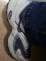
Day two of noticing logos: I had to remind myself to notice them--which reinforces the point of the exercise. Logos are so commonplace that my mind doesn't always consciously register them. I went about with a small notebook making a note of emblems on people's apparel and bags etc. (when I remembered, that is). Also, I tried to take some photos on my phone while on the bus, but I didn't get too many because I felt as if other passengers were giving me odd looks...clearly they don't think there's anything on Steeles Ave. worth capturing on camera [I didn't take pictures of people's clothes and such...I figured I could get in trouble for that].

From my observations, I found four brands which were most visible: Nike, Roots, Adidas and Reebok. In my sample set, Roots cornered the backpack market while Nike was the overall winner for footwear. Anyhow, here are some photos I took (the first bunch were taken during my bus ride):


As you can see, logos are everywhere you turn...from your phone to your mp3 player, to your notebook, pen, and stick of chewing gum...virtually every object has become a source of prime marketing space.

Tuesday, November 13, 2007

Noticing things (again)

If you will recall the days of yore, a certain assignment will come to mind, in which we had to select a common object (with which we often come into contact) to pay attention to. Well, I didn't quite pick a winner last time, so I'm revisiting that exercise. I took the suggested idea of logos and tried to notice those I saw. Not surprisingly, they're everywhere...we're inundated by symbols wherever we look. It became a bit ridiculous trying to take note of all the logos I saw outside, because every corporate office had their emblem on the building, as did chains and franchises.

Here's one funny thing, though; I happened to take YRT and VIVA to get to school yesterday (I usually go by TTC), and I realized that they have absolutely no print ads on their buses, and hence no logos displayed besides their own (I could be mistaken about YRT, but this was definitely the case for VIVA). However, VIVA has a little TV screen which runs looped ads (and inane 'news' and celebrity gossip), so I guess there are a few logos to be seen if you pay attention.

I also tried to watch out for logos on people's bags, clothes and shoes, and again there were too many to keep track of; I think tomorrow I'll just focus on this area and try to keep a running tally of those I see, like a poll of sorts. It might be interesting to see if there are any brand preferences.

On a more sketching-related note, this is what I worked on when we were using watercolours. The first one is my unfinished painting, and you can see from the accompanying photo that it needs some more work as yet.


This last drawing is one I did some time ago and tried to adjust somewhat yesterday. I would appreciate some feedback on this one; I'm not sure if I've got the positioning of the arms right for that particular pose, i.e. if she's aiming in the direction I've indicated, would she be holding the bow like that? Also, would her head be tilted upward? As I said...some input would be invaluable to me.

Monday, November 12, 2007

Watercolours!

Watercolours have both the power to relax and frustrate, but despite some minor difficulties, I had a really good time working with them today. I haven't touched my paints since before the start of the semester and it felt really good to use them again. We started off with a classic watercolour exercise, painting geometric solids to show dimension, keeping in mind the direction of light on the object. Once we were a bit more comfortable with that, we moved on to landscapes, using the photos we brought in. I started a painting of what I believe is Lake Geneva, from a photo my parents took in Switzerland. I'll scan that in later.
The point of today's class was to understand how programs like Illustrator and Photoshop evolved from classical art forms; as with watercolours (and other forms of painting), the end result using such programs is achieved by creating successive layers...it works a bit like a puzzle, but with pieces that are laid out behind and in front of each other rather than side by side. Eventually the pieces come together to create the finished picture.
Another point we touched on in class is that art isn't created on the computer (not often anyway); drawing and painting will never be obsolete because we always need to start on paper and get ideas out before we can translate them onto the computer screen. And on that note...I will go back to my sketchbook.

Saturday, November 10, 2007

A cut-out Stewie, 3 Spider-Man posters and a somewhat sore back later...

I spent a great part of today at the Graphics Canada show at the International Centre (I know this doesn't quite relate to DMA179, but it was an experience). As it turned out, the show was more geared toward people involved in the physical end of the printing industry; a lot of the exhibitors were demonstrating equipment (of the huge expensive variety), while others were paper distributors or had some other connection to printed media. In that sense there wasn't much relevance to me because the creative portion of digital media wasn't represented.

Nonetheless, it was interesting to see the equipment used to make high-quality posters, signs, etc. (this also presented me with a chance to pick up a moderate amount of swag...hence the posters etc). Exhibitors such as HP used posters as an incentive for people to stand around watching the machines do their thing, which is why I found myself waiting 20 minutes to get a 4 x 5 glossy Spider-Man poster that I knew my brother would like. HP also had one big piece of equipment that looked like a HUGE desktop printer--I mean massive, as in, several people could have stood around comfortably inside it. I would have taken a photo, but I was weighed down with brochures etc. at that point.

On a more relevant note, here are a couple of drawings to do with my toy project...I think I mentioned them earlier but didn't get around to posting them. The first is my logo, which may not be complete yet...I'm stuck on this idea and I don't want to let it go. The other drawings are ideas for box art for Little Red, as well as an expansion idea for Hansel and Gretel toys.


Tuesday, November 6, 2007

Not enough action...


Get your head out of the gutter...I was referring to this sketch I did over the weekend. For some reason, when Joe asked us to do some drawings for use in PS, I assumed he wanted a sort of hero figure...and I came up with this. The problem is, it's too static (seeing as it's meant to be an action figure); I could have spent my time better developing the other outline sketches I did of people doing sporty things. I think I'll work on that today.

While on the subject of superheroines, I can't help thinking how completely ridiculous it is to have a woman running around in high heels fighting crime and evil-doers...

Sunday, November 4, 2007

Arrghh...


This weekend feels like it was a complete waste. I'm not sure about everyone else, but it seems as though the less work we have to do, the less that gets done; and at the end, you realize that there actually is a bunch of stuff that needs dealing with, and you end up in a mild panic. My sketching feels uninspired...in search of help in drawing comic figures, I turned to a book, which I suppose isn't the worst, but I don't have much more on the page than I started with. I feel restless and discontent.

In view of that, I need to focus on something that IS done, so here are a few things I've done for previous DMA101 assignments. The first is the end result of my vector trace and the others are two of my 3D objects.